Weber:
Mobile App Experience
Principal UI/UX Designer
The Weber Connect Smart App emerged from the merger of June and Weber Inc., combining intelligent cooking technology with Weber’s wide grilling products. By leveraging machine learning and image recognition from the June Oven, we used real-time cooking data to continuously improve the experience. The long-term vision was a unified, scalable app platform—one core system, thoughtfully adapted across products.
MVP App
We launched a focused MVP to iterate quickly, delivering core features like timers, probe and cavity controls, live graphs, recipes, settings, and grill management.
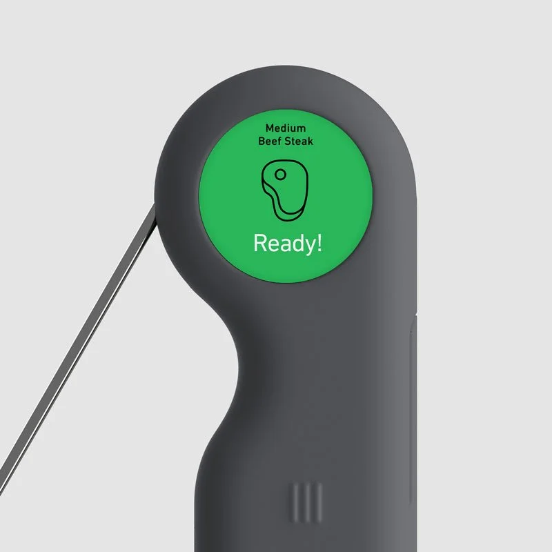
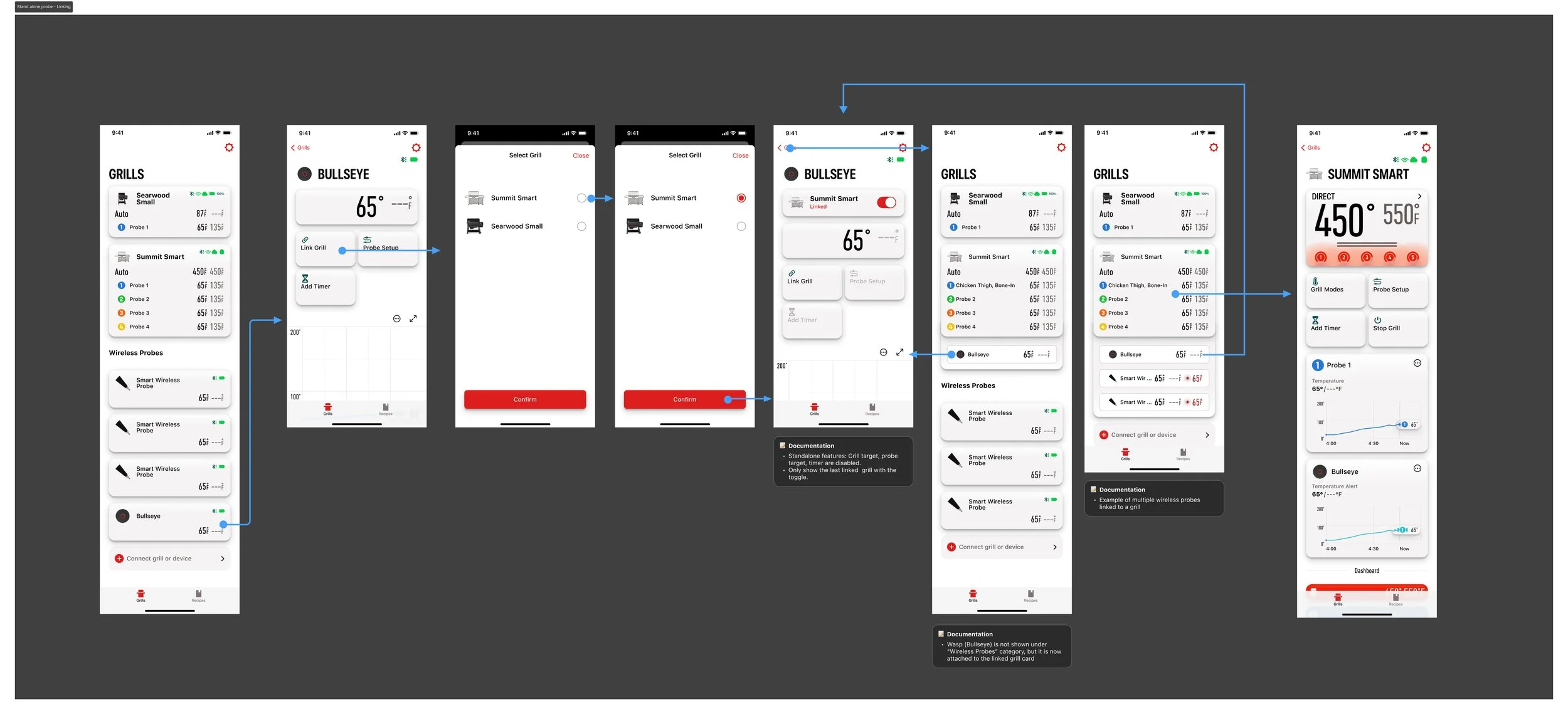
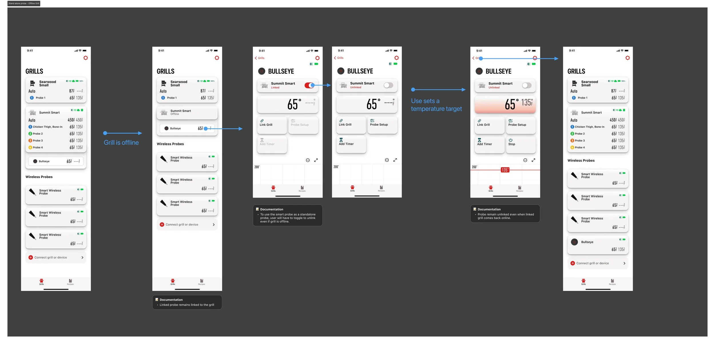
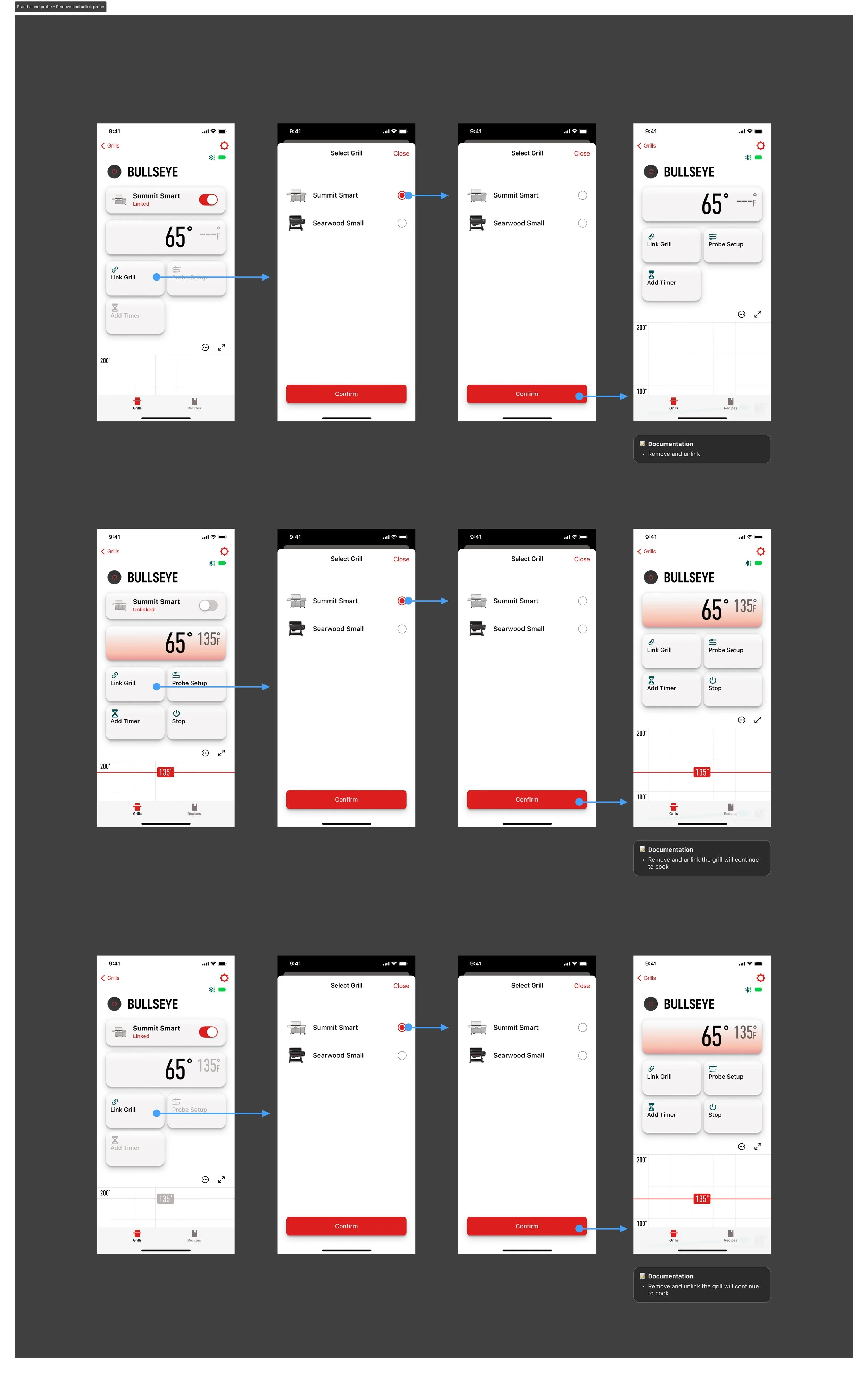
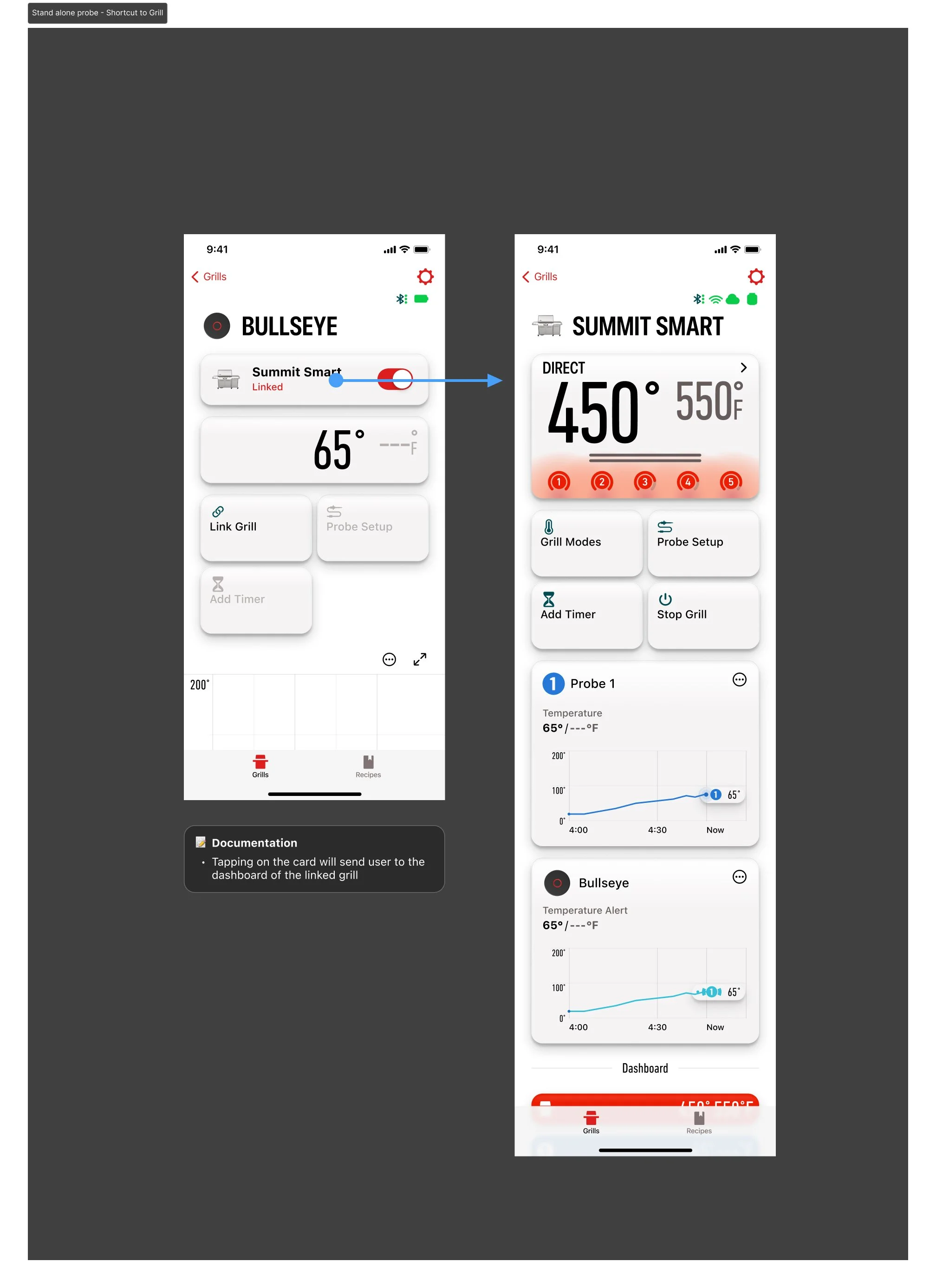
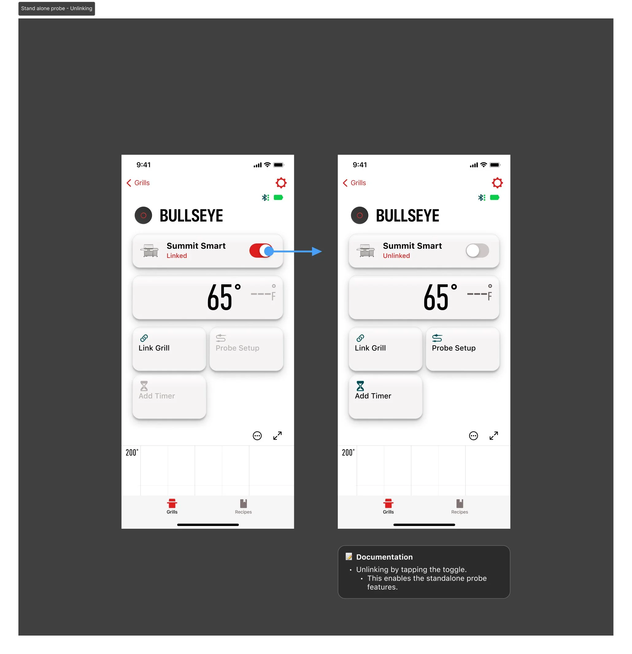
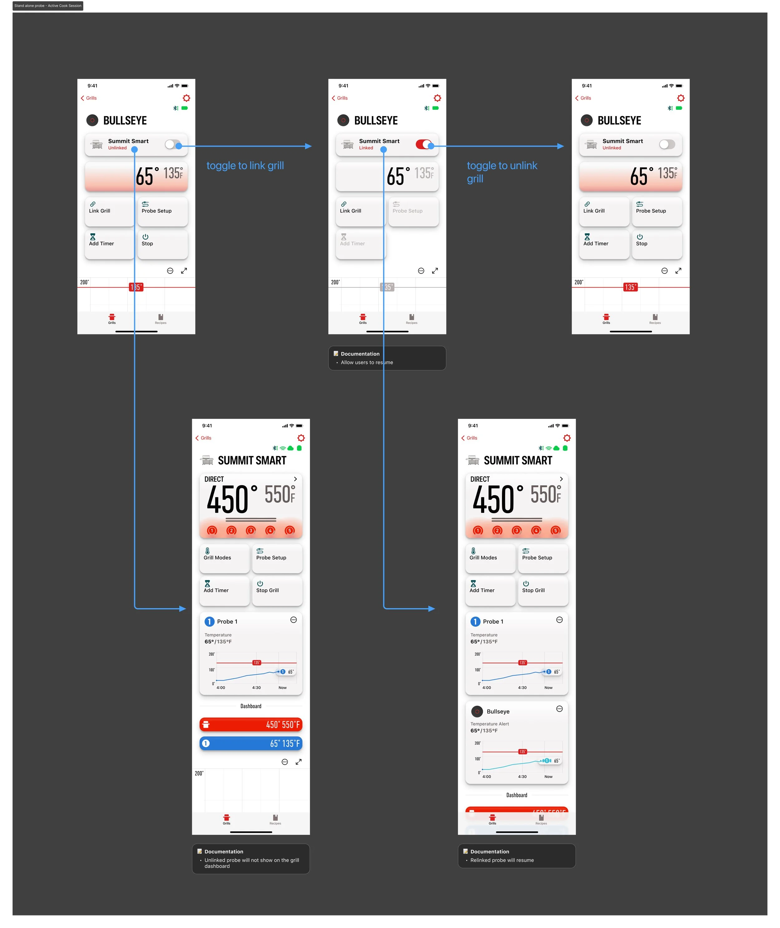
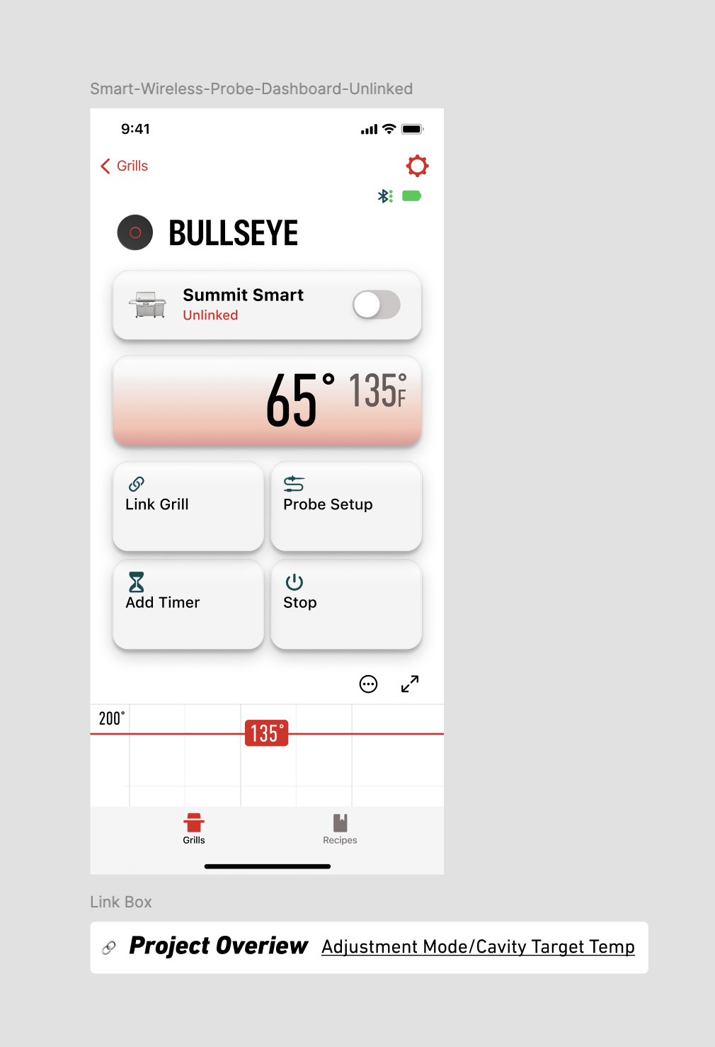
Smart Wireless Probe linking
When a Smart Wireless Probe is paired with the companion app, it appears as a connected standalone device on the grill root view. From there, users can link the probe to a specific grill—enabling it to surface on the grill’s dashboard—or keep it configured as an independent standalone probe.
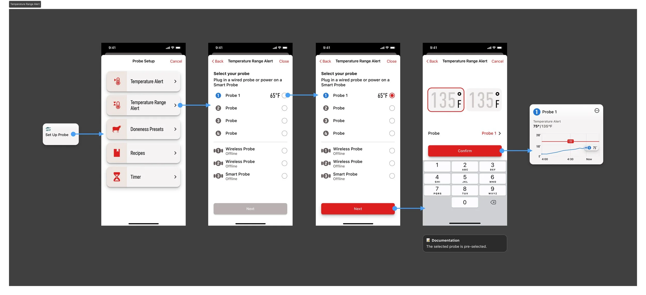
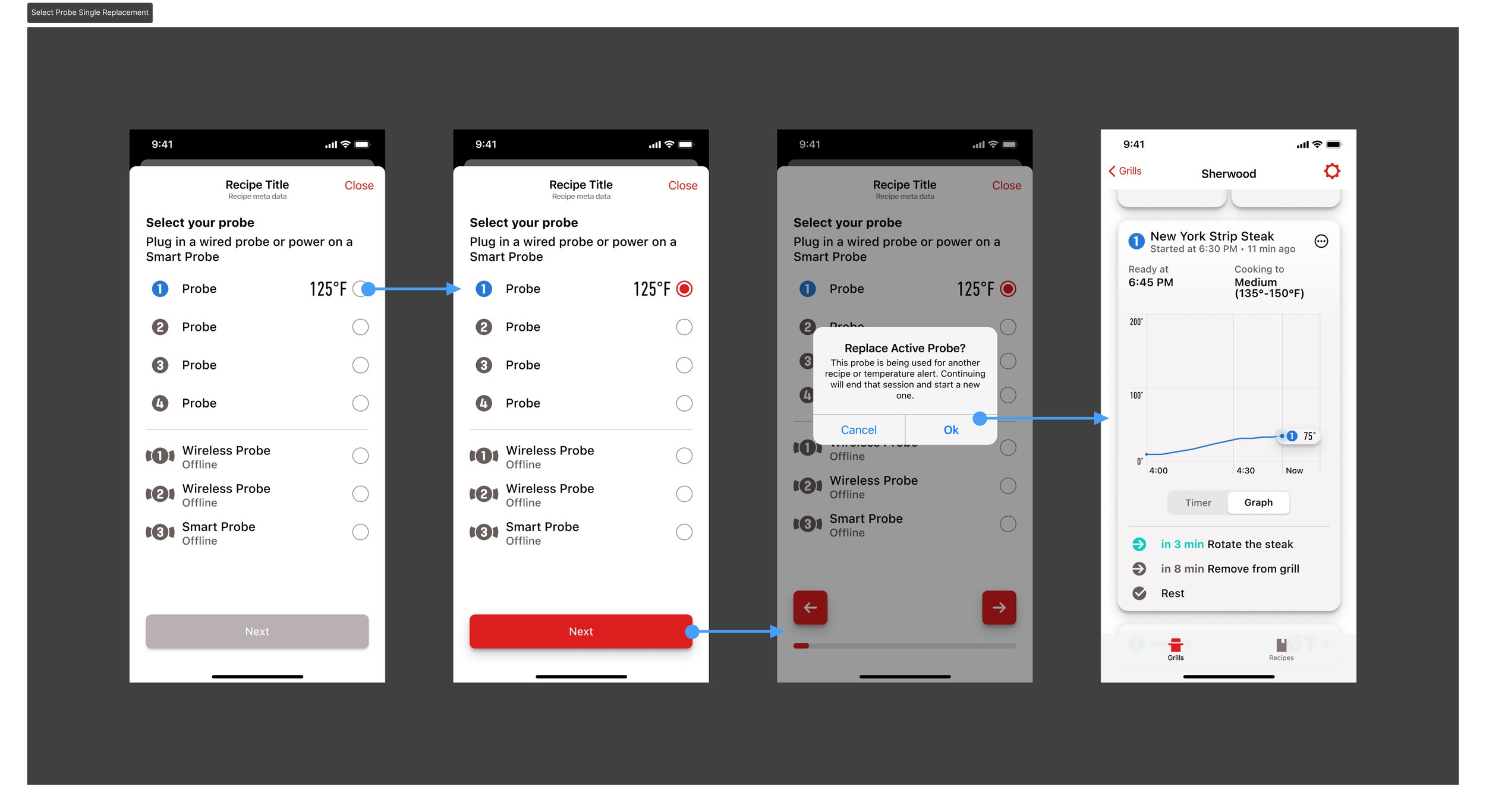
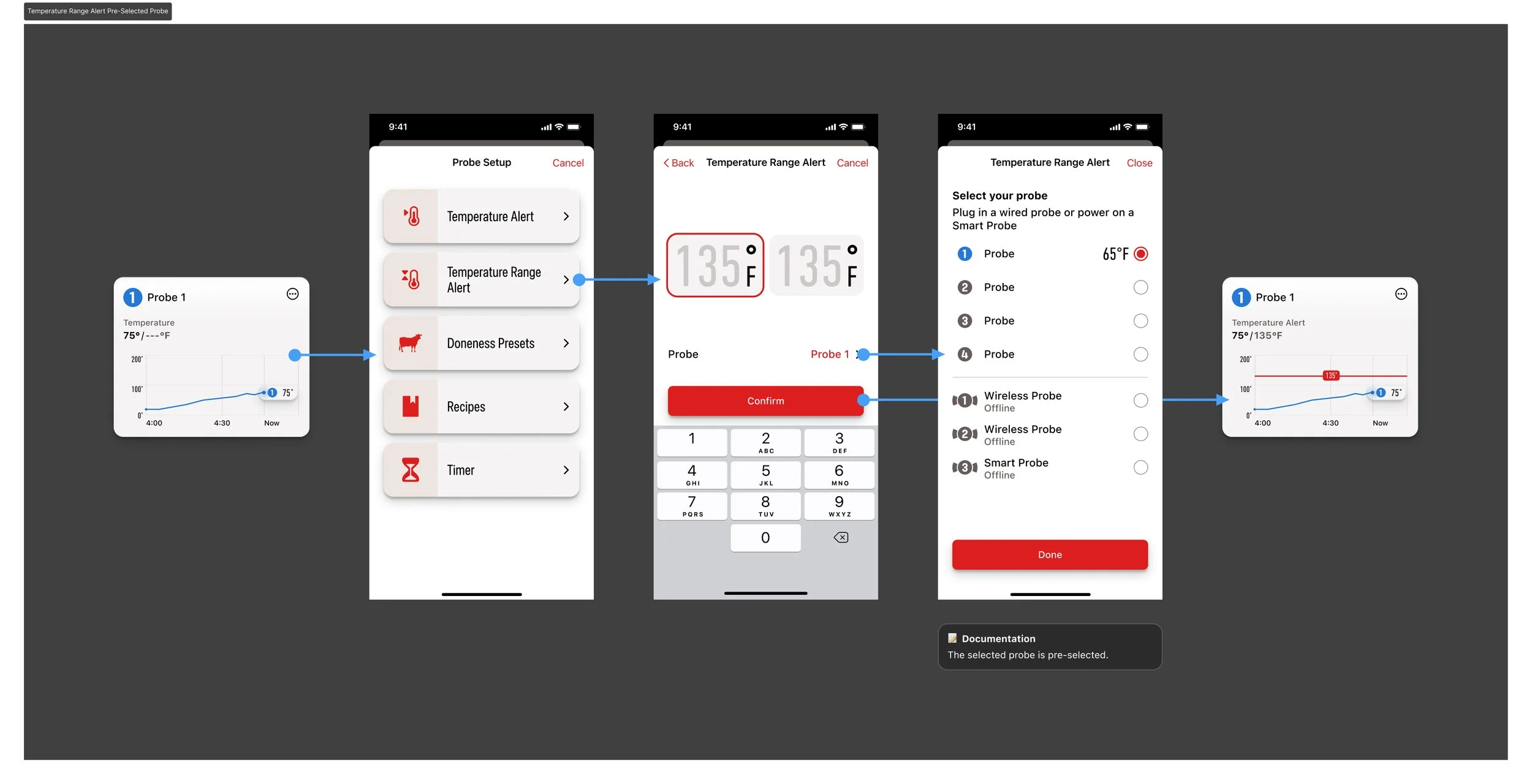
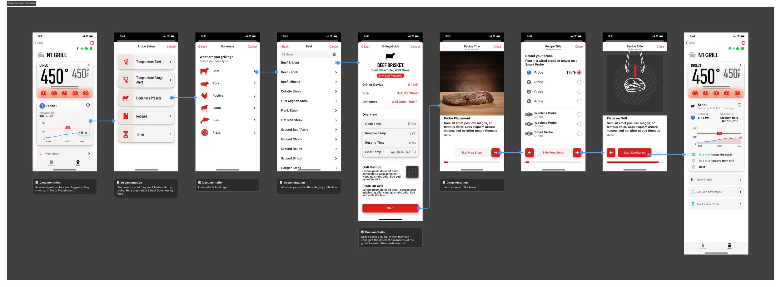
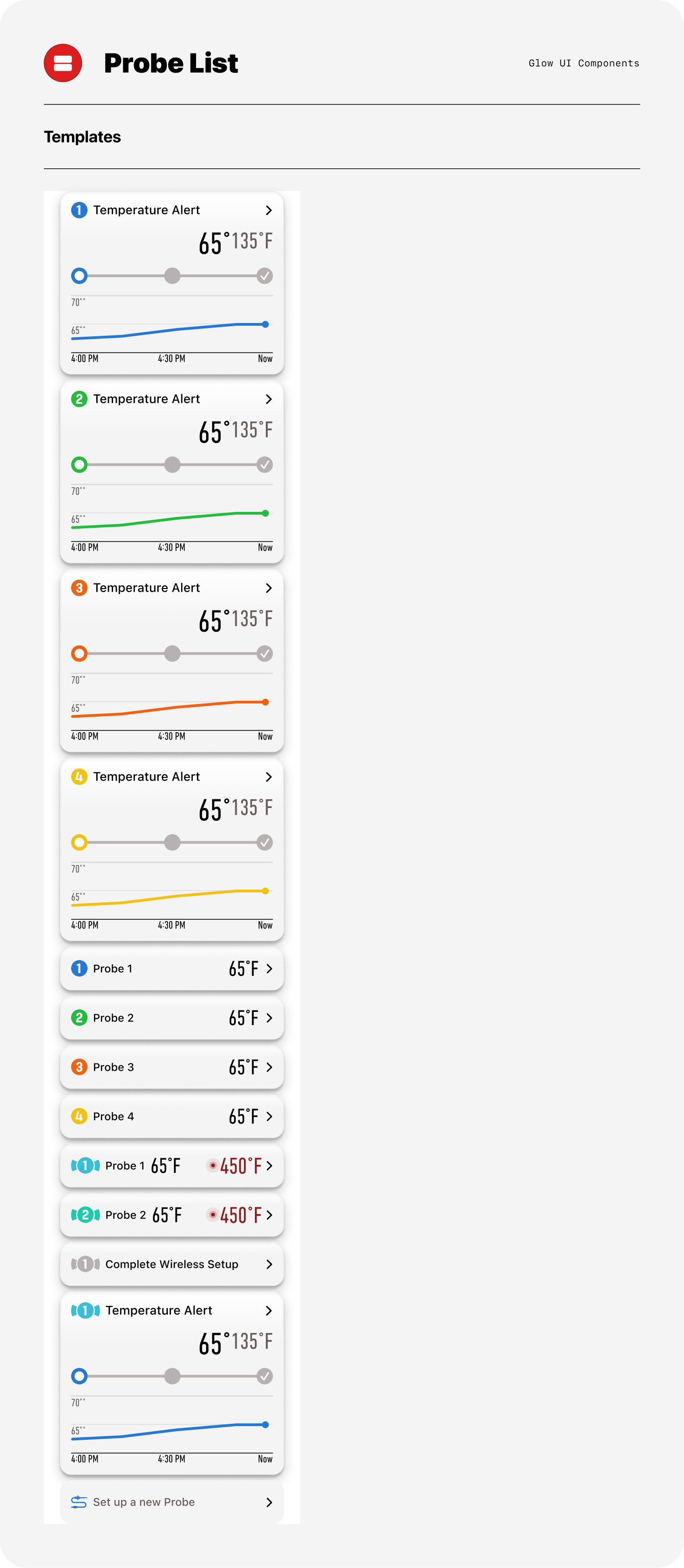
Probe Usage
Recipe
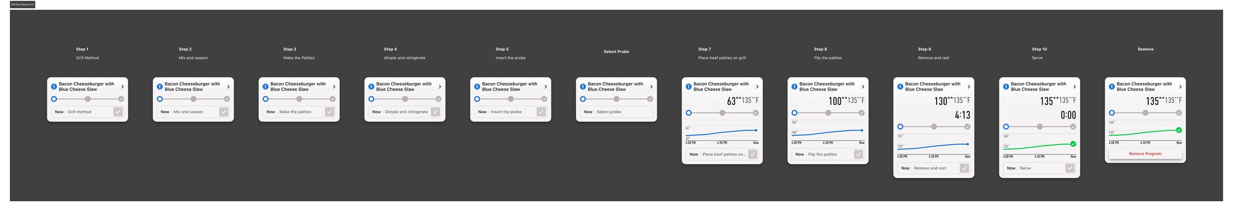
The original recipe player required too many steps before monitoring could begin. The redesigned flow reduces this to three clicks, allowing users to start monitoring immediately and bypass previously required prep steps.
Next Evolution of the Mobile Experience
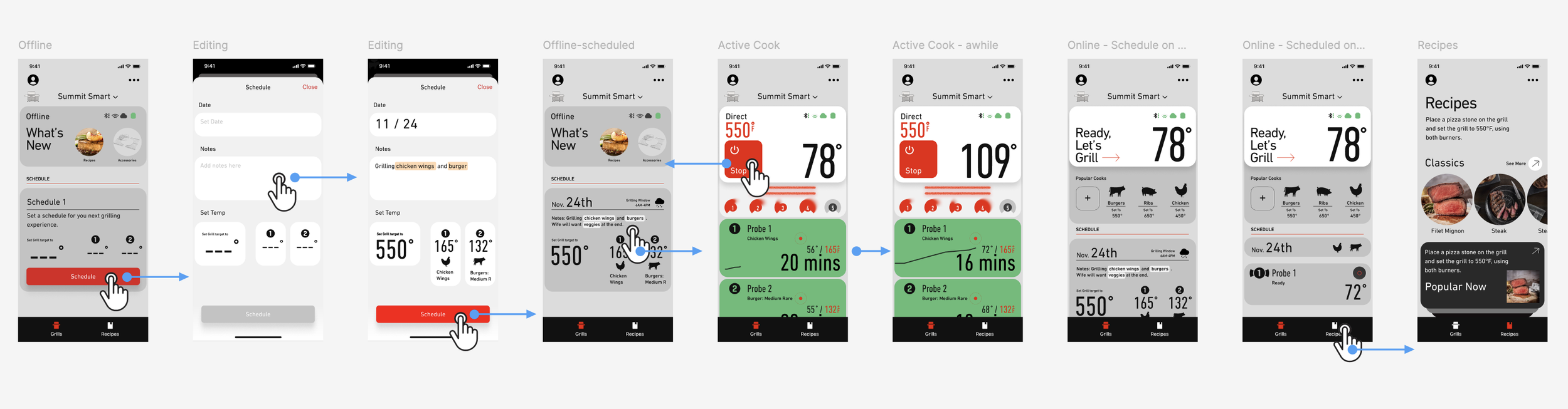
As engineering capacity expanded, I evolved the dashboard from a basic status view into a sous-chef companion that actively guides users toward grilling mastery. I mapped the end-to-end journey—pre-pairing, paired offline, ready, and cooking—and introduced AI-powered planning in the offline state. Through simple natural language input, the system auto-configures temperatures, probes, and timing, enabling one-tap setup and transforming a fragmented process into a seamless experience.
Simple Happy Path and Sample Screens
AI Vibe Prototyping
Vibe coding and rapid prototyping have made many design tasks more efficient. To convey an idea and move it forward, the best way to convince stakeholders is often visual—showing the design’s value through simple interactions that lead to clear, intuitive user journeys.
System Component Library
Components are organized by usage and placement within the app, with each group serving a clear structural purpose. The library is intentionally scalable, allowing new patterns to integrate seamlessly into the broader system.
Sample pebble card matrix showcasing recipe modules that integrate probe and timer functionality across multiple cooking states. The matrix demonstrates how a flexible component adapts to varying data conditions while maintaining consistency in structure, behavior, and visual hierarchy.
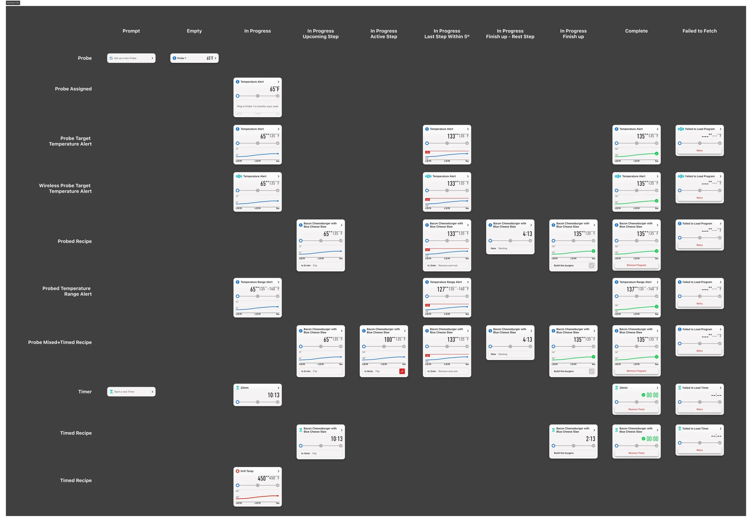
Life cycle of a Probe card
Flexible Components
File Structure
Before I took ownership, all work lived in a single, compressed project file—making features easy to locate but difficult to manage across workstreams such as in-progress, exploration, upcoming releases, and active development. I restructured the system by separating files by feature and consolidating all relevant artifacts within each one, creating clearer ownership, better version control, and a more scalable workflow for cross-functional collaboration.
Feature Requirement Management
Information was previously fragmented and often restricted by access limitations. Since Confluence was accessible company-wide, I established it as the single source of truth. I structured it to support cross-functional clarity—enabling product managers to define acceptance criteria, design to link Figma files, prototypes, and user flows, and QA to access demo scripts and specifications—streamlining collaboration and improving overall delivery quality.
Links to confluence page for full feature overview.